Qua-Li, a well-known brand in Indonesia for its affordable Chinese food, faced a challenge as its loyal customers grew older and younger generations lost interest. Once a popular spot for students, it had become a brand people remembered but no longer actively sought. Qua-Li turned to Porta to make the brand relevant again.
Immersion
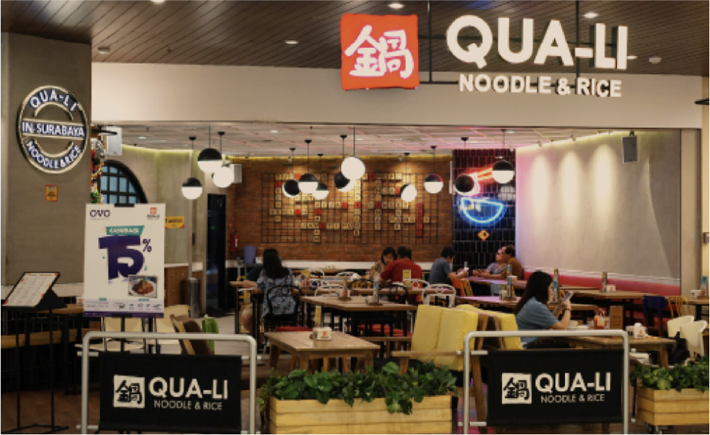
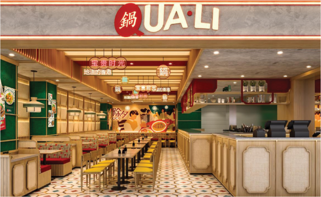
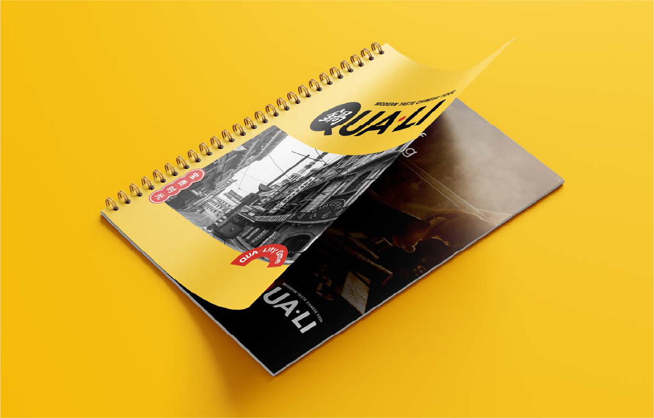
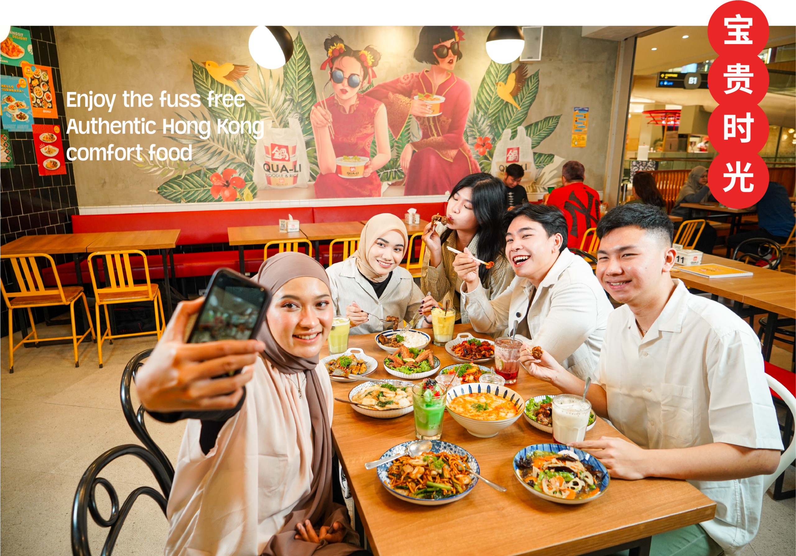
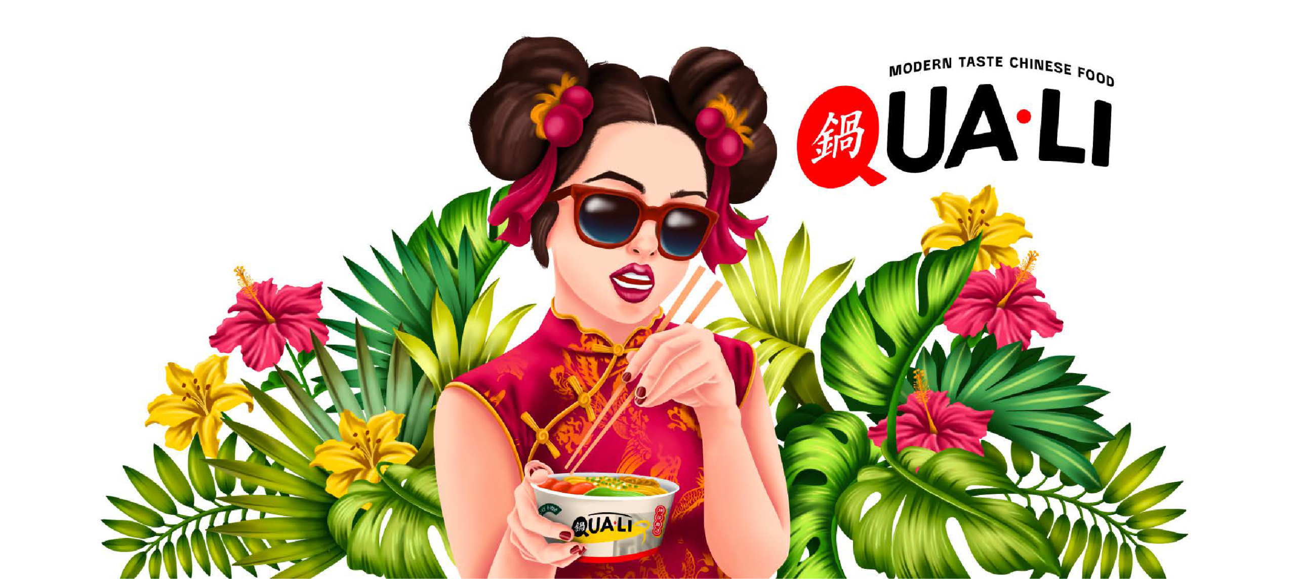
We rebranded Qua-Li with a modern Hong Kong café concept, blending familiar Chinese food with a trendy, vibrant atmosphere. The updated logo and interior design reflect a fresh, urban charm, combining nostalgic elements with a contemporary edge to appeal to younger diners.
Qua-Li didn’t need to reinvent its beloved food and affordable prices. What changed was the market.
“Gen Z and millennials no longer connected with Qua-Li’s outdated look, vibe, and menu.”
Our job was to reactivate its relevance.
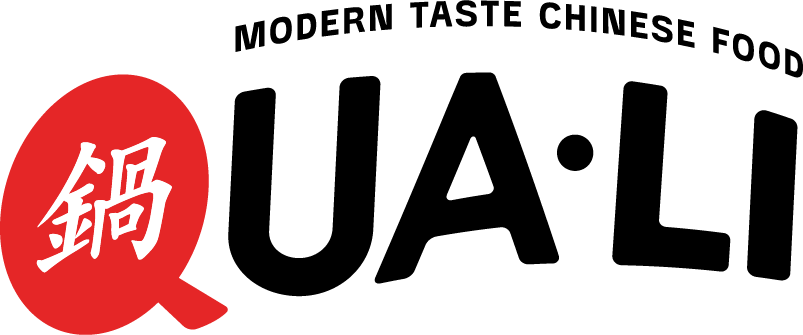
Old Logo
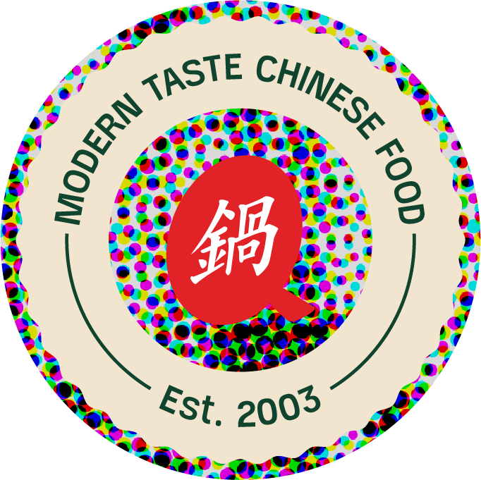
New Logo
Porta revamped Qua-Li’s logo and interior, drawing inspiration from Hong Kong cafés to create a vibrant, modern space that appeals to younger diners while keeping the brand’s familiarity.
The Q inspired by the shape of wok and bubble chat to represent the start of warm conversation with your family and friends.
The curve shape represents movement, happiness, and positive emotion that Qua-Li wants to give to the audience.
The dot symbol represents accessibility and robustness, symbolizing sturdiness.
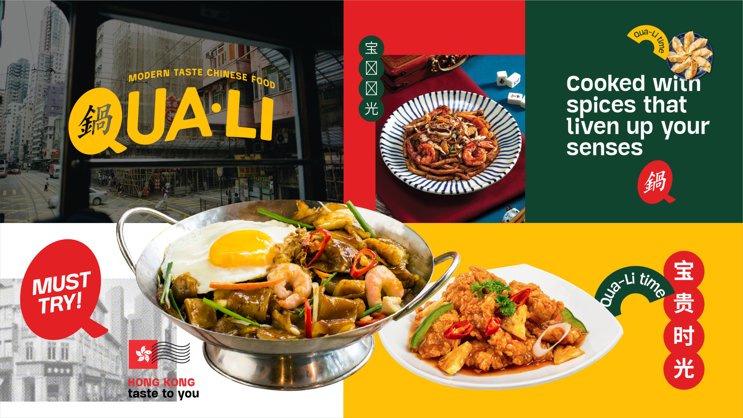
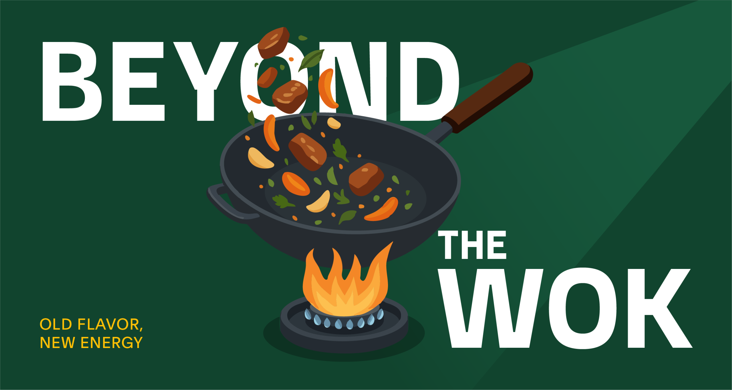
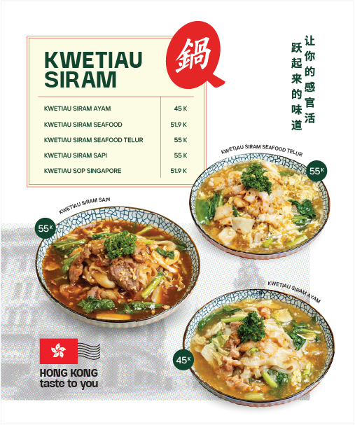
Signature Dish Refresh
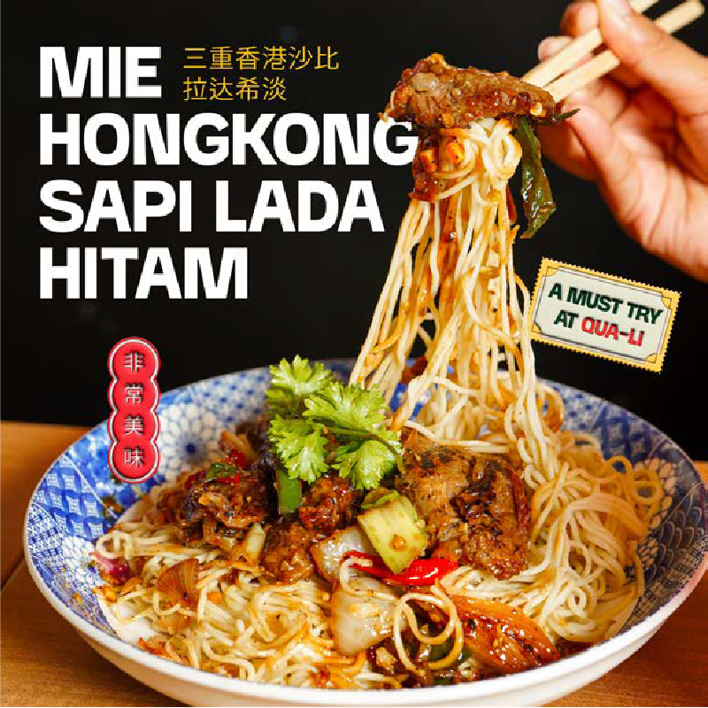
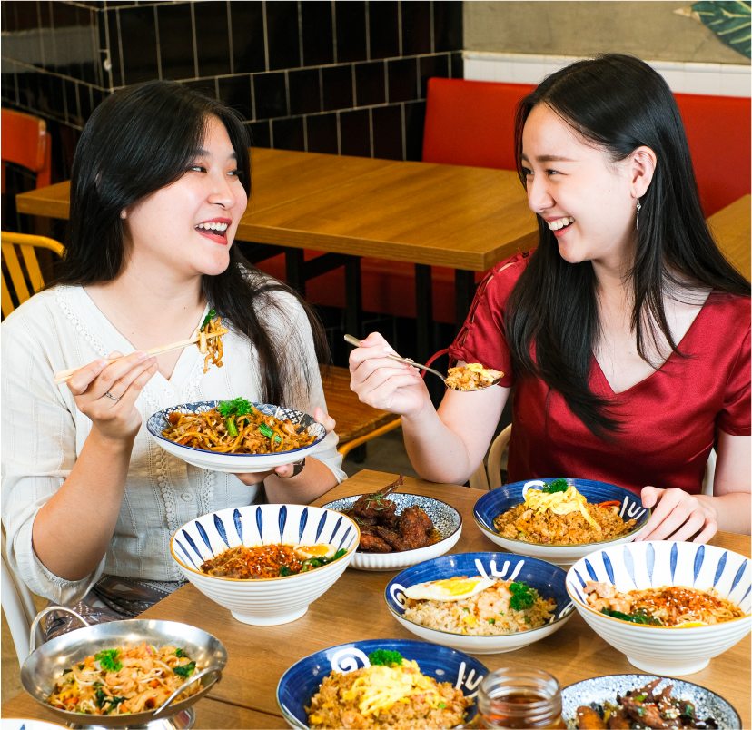
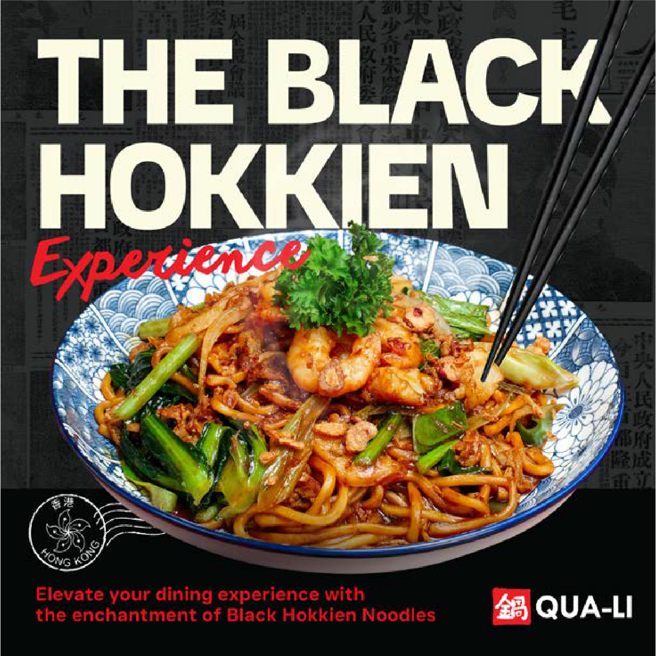
Qua-Li’s rebrand included a bold menu update, shifting the focus from their traditional Nasi Goreng to a new signature dish, Kwetiau Goreng. This subtle yet strategic change appealed to younger audiences and signaled the brand’s evolution
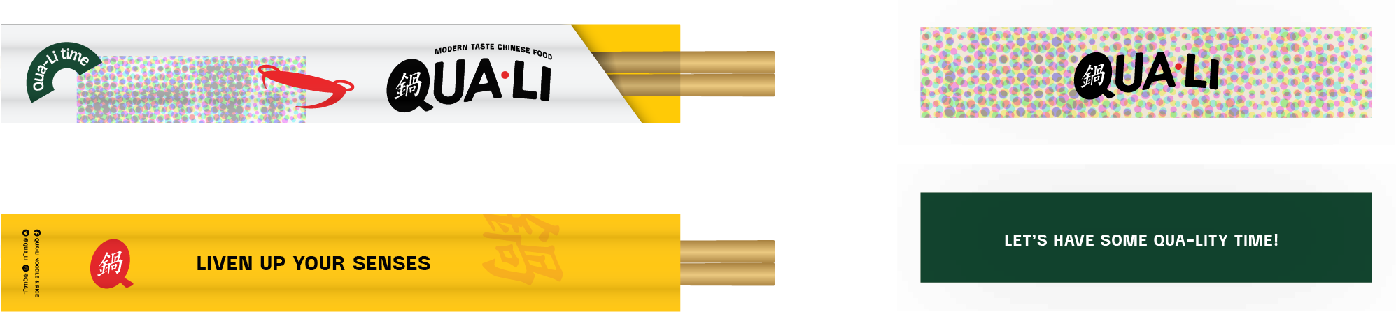
The Details That Tie It All Together
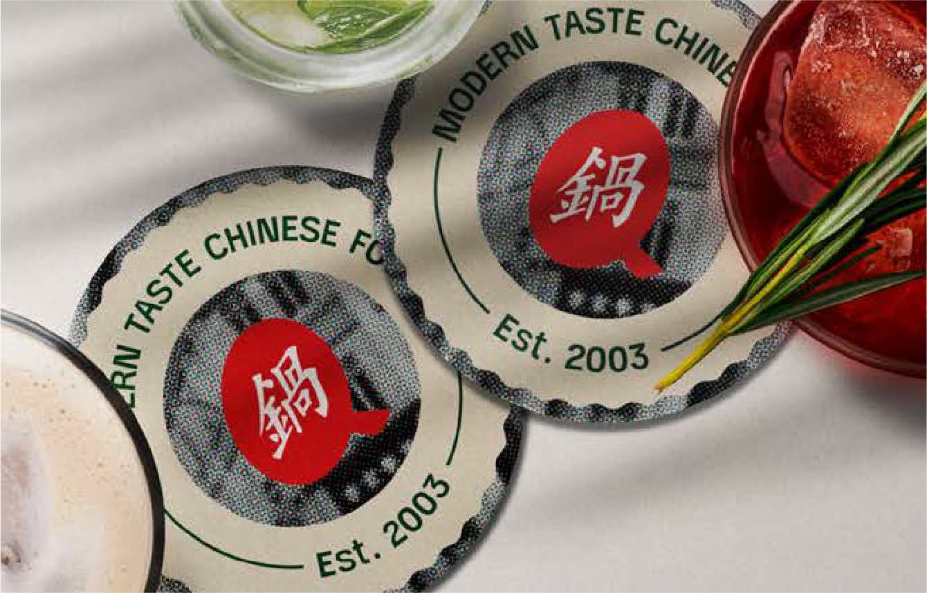
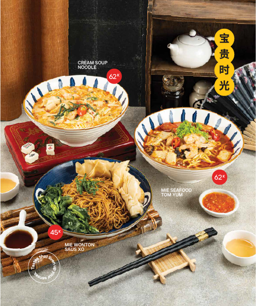
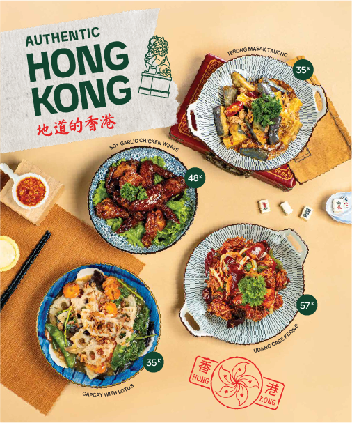
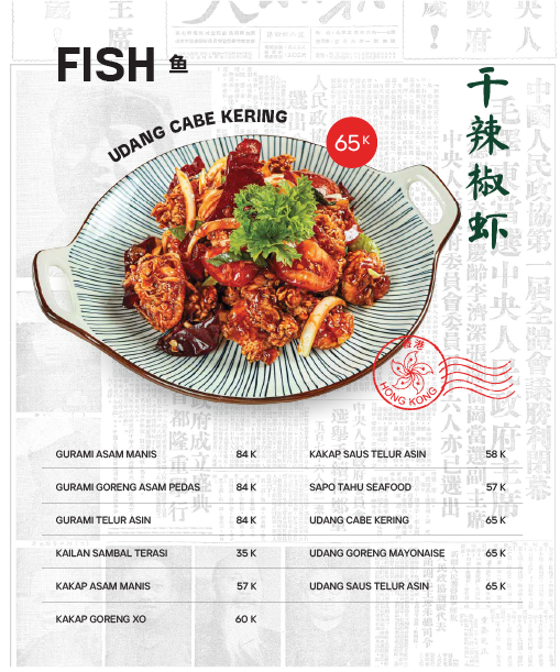
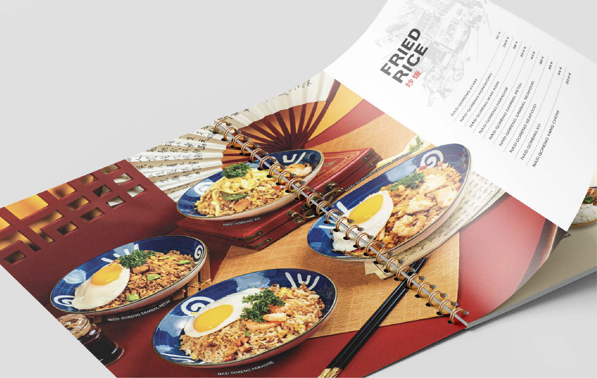
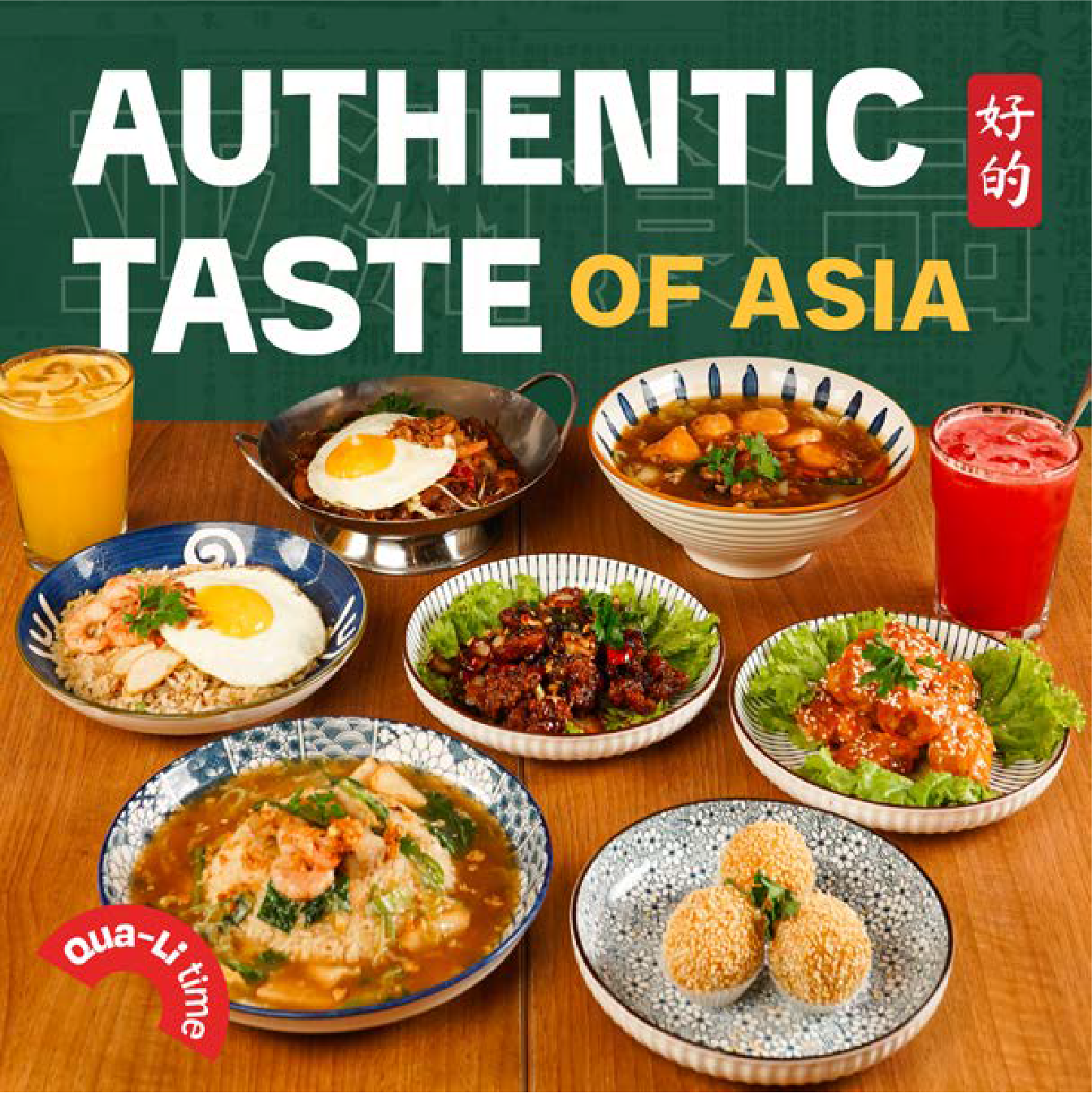
We focused on smaller but equally important touchpoints alongside the major changes, such as revamping the menu book to align with the new brand tone and café aesthetic, designing utensils and restaurant stationery to create a cohesive dining experience, and producing visual assets and printed materials to bring the new identity to life across locations.
While these touchpoints might seem minor on paper, they play a significant role in elevating the overall experience and completing the rebrand.
Impact
When Airbnb approached us, the brand had outgrown its original identity and had become something much more meaningful. This growth signalled something more: Airbnb didn’t just need a new visual identity, it needed a brand. vOne that could express the vision of its founders and guide and support its business through exponential growth, and whatever the future may hold.